

Sharp ideas. Blunt delivery.

FIELDNOTES.

Ideas, identities and worlds in the making.
A closer look at Blunt Logik.

Fieldnote 001 / Studio identity

A NAME
WITH A
POINT.

Two words. One deliberate spelling.
A little directness. A little mischief.
A studio taking shape.

Get to the point
BL / 001 — Rising CutBlunt Logik Rising Cut wordmarkIndependent minds. Interactive worlds.

01 / The name

A LITTLE
BLUNT.
BY DESIGN.

Blunt Logik is a name with two instincts: say what you mean, then leave room for the unexpected.

“Blunt” brings the directness. It also brings the wink. “Logik” adds a sense of intention, with a final K that gives a familiar word a slight swerve. Put them together and there’s a useful tension: a clear idea, delivered with a personality of its own.

That feels like a good place to start a game studio. We’re drawn to distinctive worlds, memorable characters and small decisions that get beautifully out of hand. The name gives that approach a voice. The games get to give it a life.

02 / The mark

HEAVY TYPE.
ONE SHARP IDEA.

Meet Rising Cut. A solid name, an upward line and one small detail with a little heat.

Blunt Logik wordmark in ivory with an orange ember

After dark. Warm ivory, deep ink and a single ember.

01

A name with weight.

The two stacked words form one confident shape. Heavy letterforms and blunt ends give it presence, while open spaces keep the name clear. It can hold the screen without needing a paragraph beside it.

02

A cut with a purpose.

The diagonal strip does two jobs: it separates the words and pulls the whole shape upward. Look again and there’s the rolling-paper reference, worked into the structure rather than sitting beside it.

03

Just enough heat.

One ember breaks the ivory silhouette. A small flash of orange gives the eye somewhere to land. It’s the little unruly detail in an otherwise deliberate piece of Logik.

03 / The colour

INK. IVORY.
A LITTLE FIRE.

Deep ink gives the identity its ground. Warm ivory keeps it human. Ember orange supplies the interruption.

01 / Studio ink#172731
02 / Warm ivory#F4EEE5
03 / Ember#F3692C

The line we come back to

SHARP IDEAS.
BLUNT DELIVERY.

Think carefully. Give the work a point of view. Keep a little room for mischief.

An aged cream-and-brown RV beside a small Florida bungalow, under a coral dusk sky.
VHS & THC / Original concept artwork · Not gameplay

04 / Beyond the wordmark

THE STUDIO
HAS A NAME.
THE WORLDS
HAVE A VOICE.

The studio identity sets the tone. Each game gets its own atmosphere, colours and characters.

First up: VHS & THC. Bluntford, Florida. Summer, 1986. A borrowed RV, a pager that won’t stay quiet and a very questionable business plan. A world with its own kind of Logik, still taking shape.

Step into Bluntford

WELCOME TO
BLUNTFORD.

Florida, 1986. The sun bleaches the storefronts. After dark, the neon does the talking. Somewhere between the two, you’re trying to build a better life.

VHS & THC starts with an RV, a small growing operation and a town full of possibilities. Its personality lives in the ordinary things: a corner shop, a bicycle, a pager, the click of a cassette and the uneasy sound of a police scanner.

An aged cream-and-brown RV beside a small Florida bungalow, under a coral dusk sky.
RV exterior concept from the studio archive. Not gameplay.

A place with a personality.

VHS & THC is a single-player browser game, with a world that is still taking shape. The ambition is a world that feels tactile and lived in, with room for growing, hustling and getting yourself into trouble.

Bluntford is still being built. The artwork here is a visual exploration of its atmosphere, rather than a screenshot or a promise of finished game quality. We’ll let the actual game show its progress as it takes shape.

Meet VHS & THC
THE PEOPLE
MAKE THE PLACE.

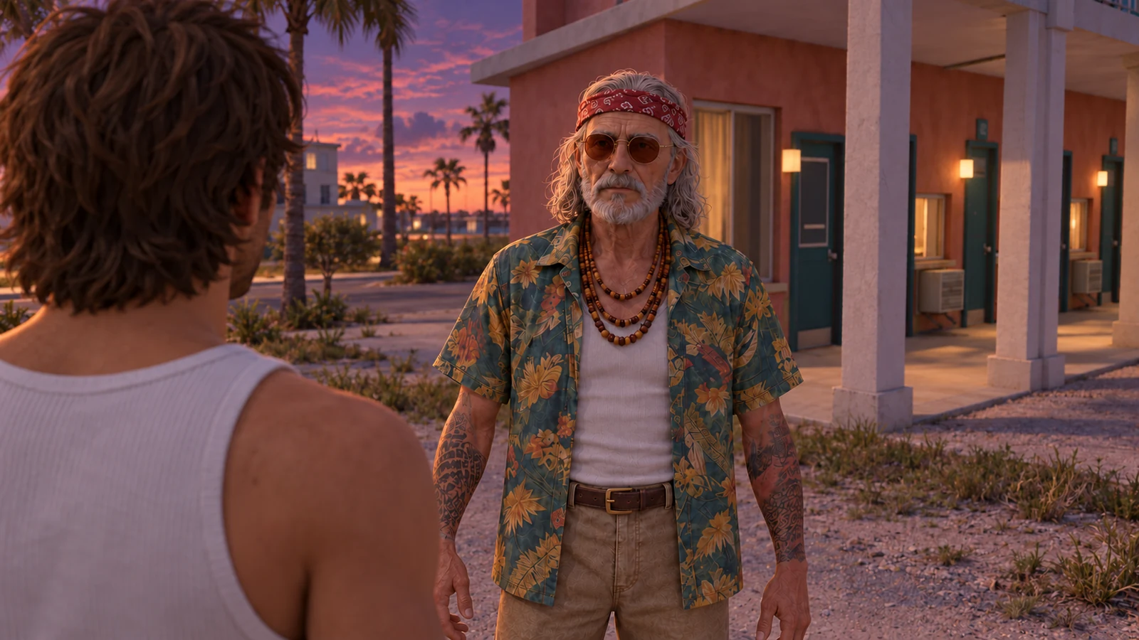
A town is more than its streets. Gram’s advice, Jun’s first order, Ozzie’s introduction and Buzzkill’s suspicions give Bluntford its voice.

An elderly, bearded man in a floral shirt and red headband, outside a coastal building at dusk.
The Gramfather / character concept at dusk.

“Always keep a quarter for the payphone. And a second quarter. For emotional support.” Gram’s wisdom arrives through the devices that keep you connected. Sound advice is not guaranteed.

Jun is the first customer in your ledger. Ozzie is a friend of a friend. Officer Buzzkill would very much like to know what you’re doing. Each new connection adds another possibility—and another reason to watch the street.

Open the character dossiers ↗

WHEN THE
NEON TAKES OVER.

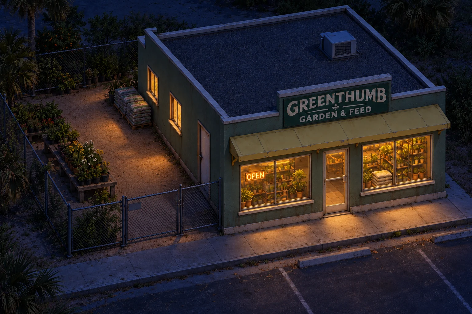
Pale Florida daylight. Coral evening skies. Deep blue streets after dark. The visual direction gives each part of the day a character of its own.

Greenthumb glows warmly against a deep-blue night scene.
Greenthumb Garden & Feed / night lighting study.

The studio’s concept archive explores that shift through places such as Greenthumb: sun-bleached materials by day, warm shop windows at dusk, and pools of light against the night.

These are visual-development illustrations. They guide the atmosphere we’re building; they are not finished gameplay captures.

Explore the lighting studies ↗
An elderly, bearded man in a floral shirt and red headband, outside a coastal building at dusk.VHS & THC / CHARACTER CONCEPT

A BLUNTFORD DOSSIER

The Gramfather

MENTOR. LANDLORD. QUESTIONABLE ADVICE.

He fronted your first seeds and owns the ground beneath your RV. A warm old crook with good instincts, bad advice and a rent reminder for every occasion. Gram’s wisdom arrives through the pager, phone and answering machine. It is usually worth listening to. Usually.

Always keep a quarter for the payphone. And a second quarter. For emotional support.
01 / 04
An aged cream-and-brown RV beside a small Florida bungalow, under a coral dusk sky.

FROM THE CONCEPT ARCHIVE

A modest beginning

Gram’s lot / RV exterior concept

01 / 14